project type: brand renovation.
my role: brand strategy + copywriting.
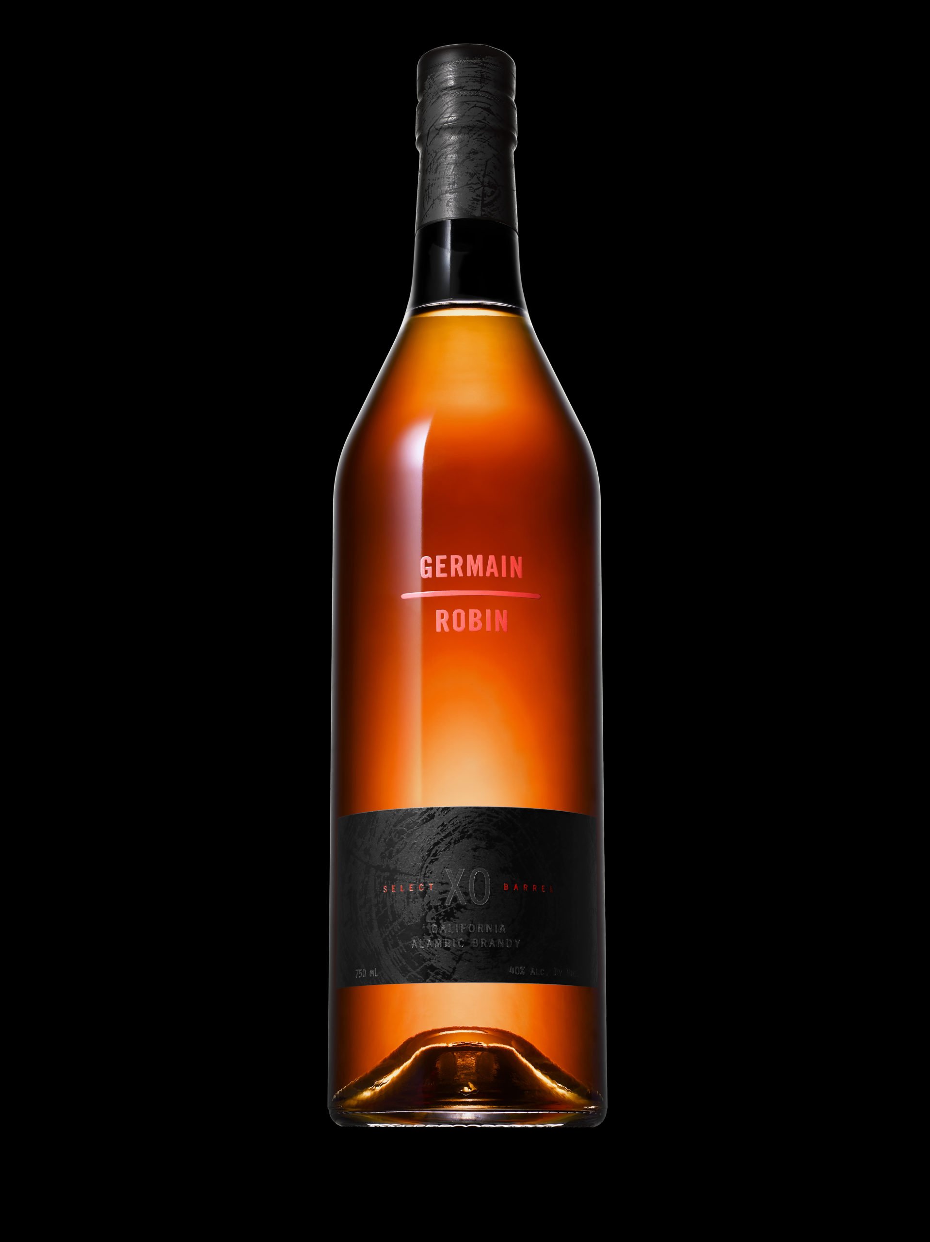
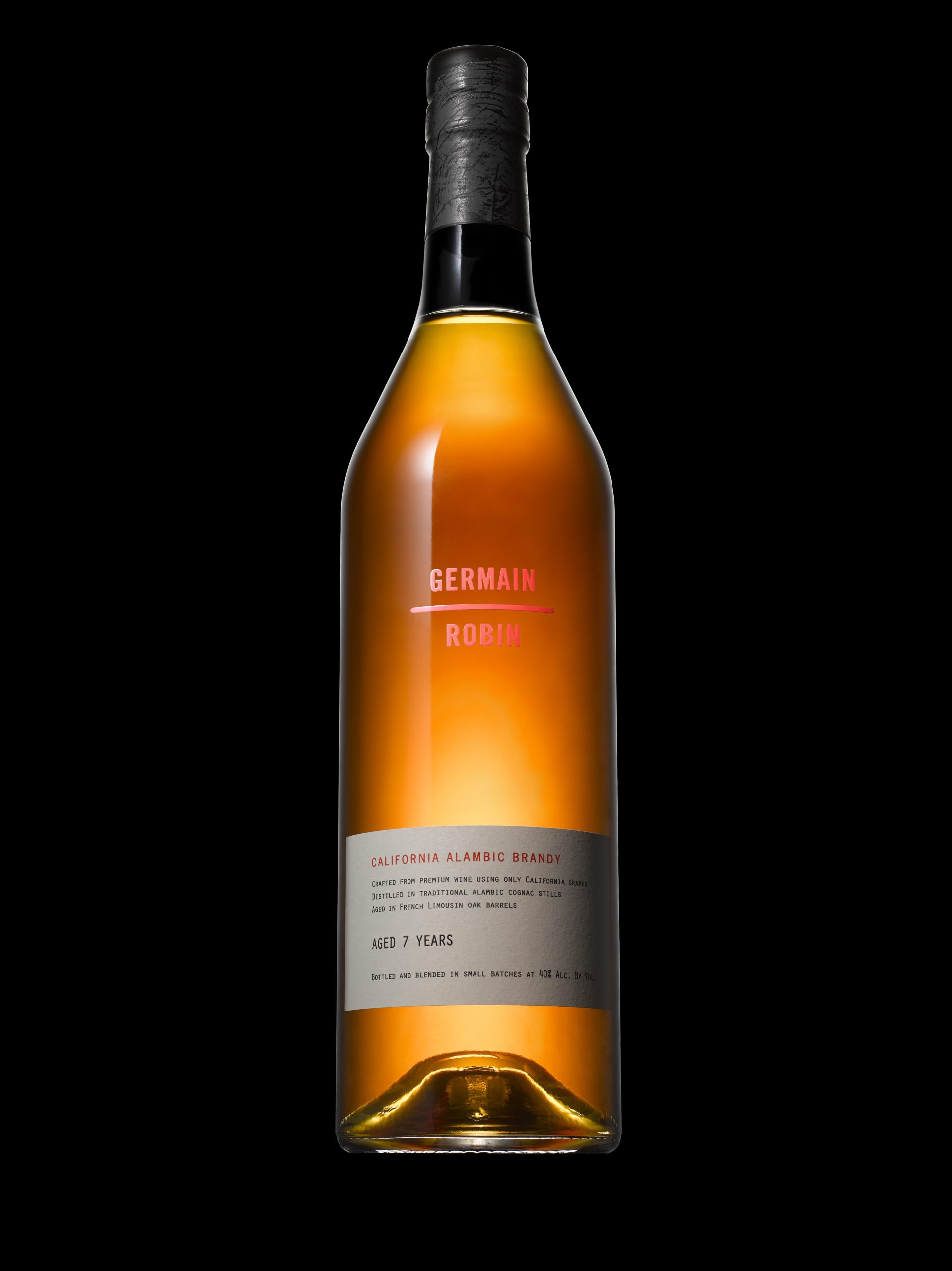
Germain Robin
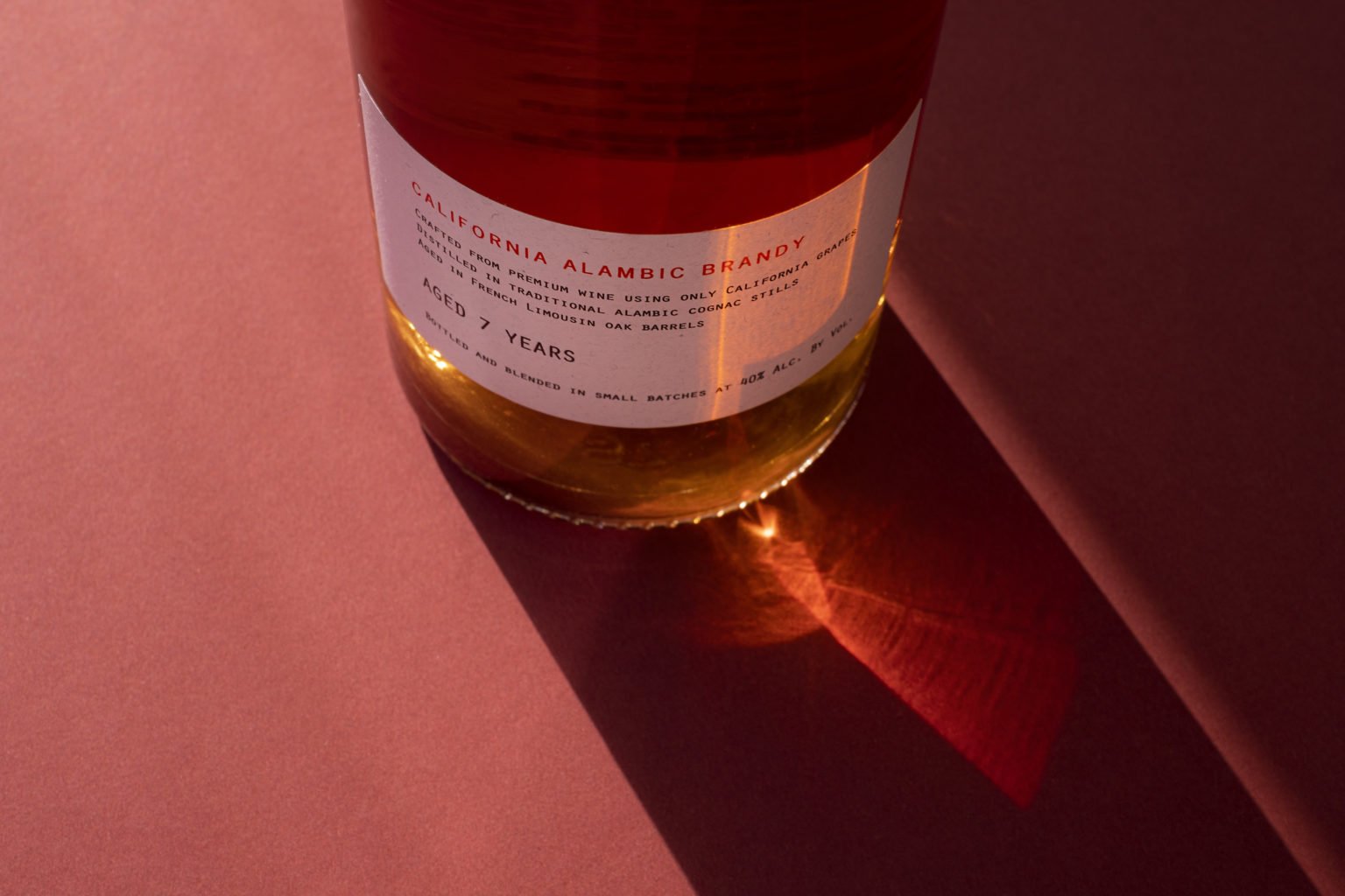
the ultimate expression of California Brandy.
TEAM.
forceMAJEURE
Creative Direction by Pierre Delebois
All photography belongs to Force Majeure
CHALLENGE. Under the leadership of Creative Director, Pierre Delebois, at Force Majeure, we were asked to rebrand Germain-Robin and redesign their packaging, staying true to the founders’ ethos while providing the quality and premium queues to make Germain-Robin the brandy of choice for connoisseurs.
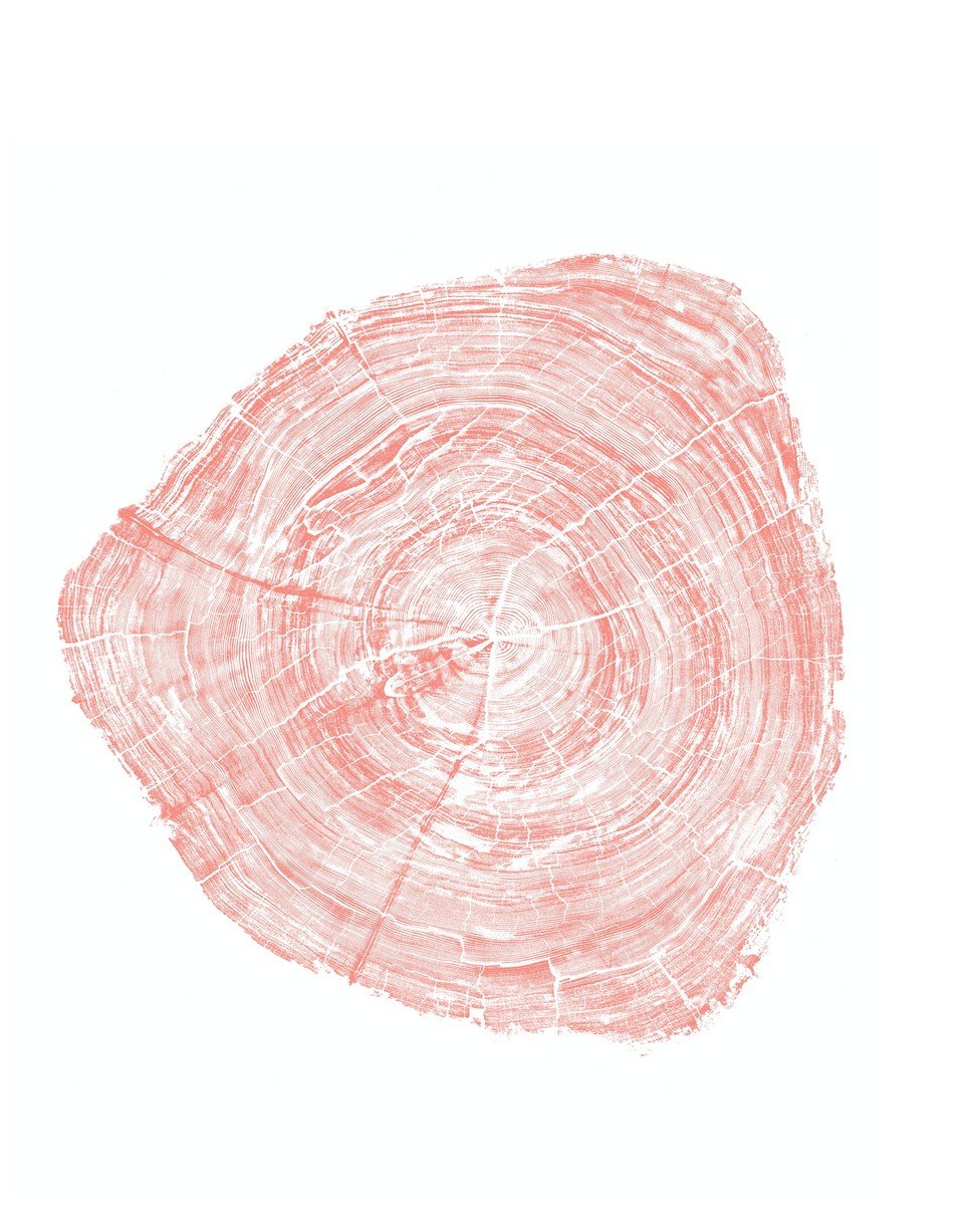
SOLUTION. We immersed ourselves in the distinctive world of Germain Robin, drawing inspiration from the majestic redwoods and the pristine allure of Mendocino. Picture the iconic Redwood Forest: towering trees, their canopies forming a natural cathedral, and dappled sunlight filtering through the lush foliage.
Germain-Robin Brandy emerges as the quintessential spirit of California, akin to the iconic Redwood Tree. This emblematic tree serves as a symbolic link to Germain-Robin's origins, paying homage to California's natural beauty and underscoring the brand’s commitment to environmental stewardship, artisanal practices, and exceptional craftsmanship.
The rebranding stayed true to the founders’ ethos: emulating the core brand value of unembellished while still uncompromising luxury, we created a clean and straightforward look for the new visual identity.

Germain-Robin began in 1982 as the unlikely union of two creative minds: Ansley Cole, a professor, and Hubert Germain-Robin, a Cognac distiller. The two partnered to create Germain-Robin, the first California brandy that broke free from the constraints of Cognac. Embracing the rich tradition of hand distillation while harnessing the potential of California wine, they set a new standard of excellence in brandy that has been recognized worldwide.
Germain-Robin continues that tradition today – advancing the art of fine California brandy into a new era.
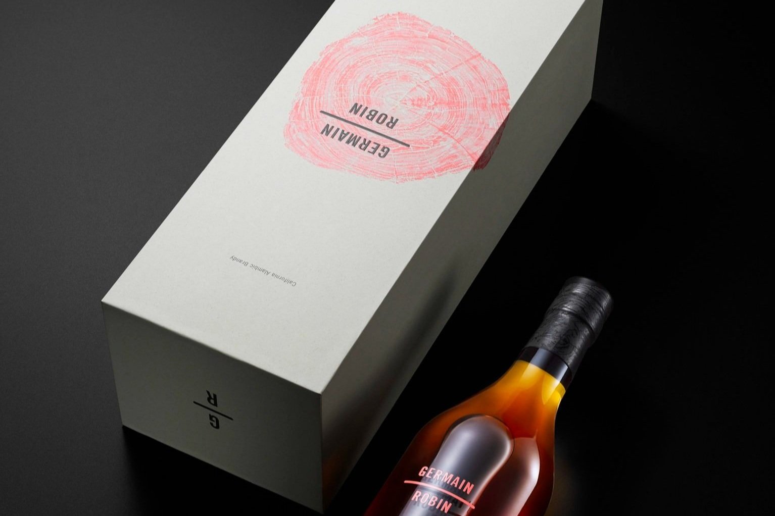
The logotype mirrors the brand's understated yet confident demeanor. The founders' names are delicately stacked and separated by a subtle line, symbolizing the quest for a perfect balance—harmony between imaginative thinking and precise execution.
Crafted exclusively for Germain-Robin by fine woodworker and artist Taimi Barty, the icon originates from a century-old Redwood Tree salvaged from the Big River. It embodies the brand's profound connection to heritage and nature, serving as a tangible expression of the brand's commitment to time-honored traditions and environmental stewardship.